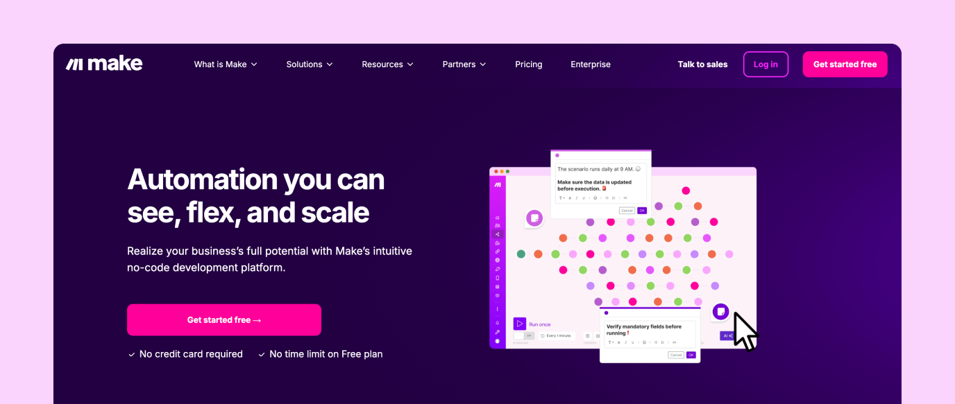
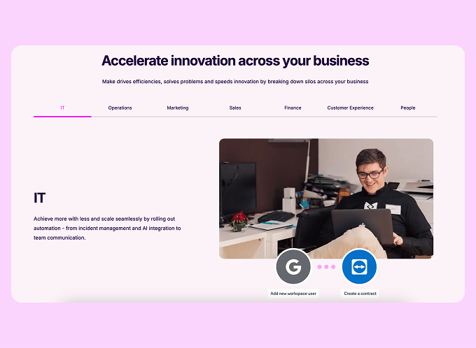
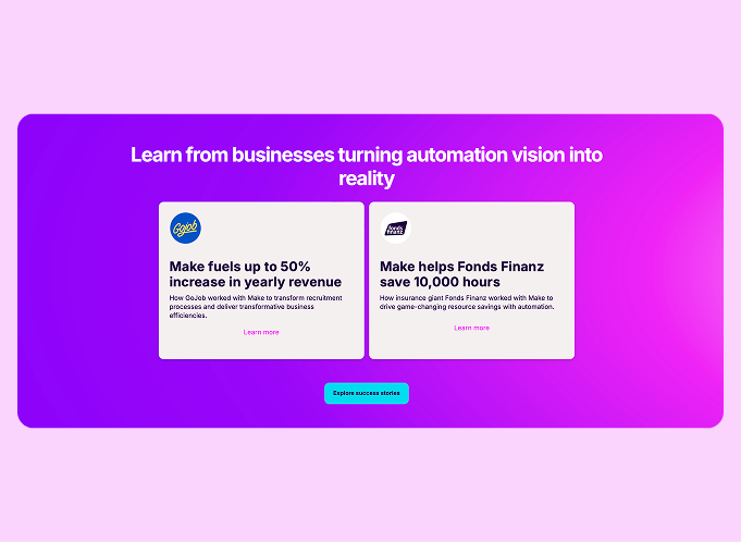
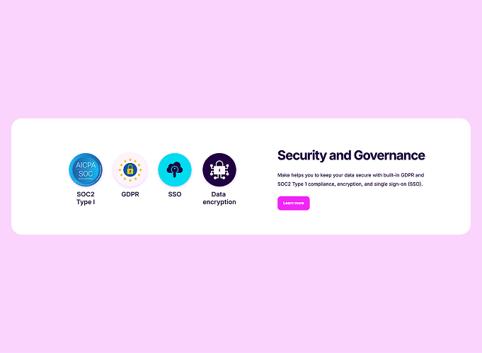
The old website struggled to engage the target audience and lacked a clear value proposition, so the team redesigned key pages with improved messaging improved messaging, visuals, and interactive elements, resulting in a 73% increase in engagement, a 1.81% boost in sign-ups, and improved navigation clicks.
Designer, Developers, Product Managers, Marketing Team
UX/UI Design, Motion Design, User Research
Improve engagement, clarify messaging, enhance UI/UX, and optimize for conversions
3 months (Research, Design, Testing, Implementation)
The website's imagery and structure were outdated and struggled to effectively convey Make's value proposition to customers. To address this, we updated 3 key pages, tailoring them to our target audience.
One of the biggest challenges was the tight 3 month timeline, requiring us to prepare the work within a short period.
Additionally, we needed to accommodate our proposed designs to the existing CMS components to save development time. Close collaboration with the development team allowed us to achieve amazing results within these constraints.
We updated the flow of the pages by adding crucial sections—based on research—tailored to our target audience, including security, case studies, available app integrations, and use cases.
After publishing the pages, the new flow received great user feedback, with many stating that there was just enough information to learn about the product.
We also focused on optimizing the use of white space, aiming to maximize the amount of product information and value delivered with every scroll.
One of the most significant changes to the pages was the addition of product animations, which I created.
The initial animation was misleading and oversimplified the product experience, making it seem easier than it actually is for non-technical users. This led to unrealistic expectations about building in Make.
The new animations clearly represent the core benefits of the product, showcasing its visual nature, flexibility, scalability (with over 8,000 pre-built solutions), and collaborative features—while also demonstrating Make's actual functionality.
Users mentioned that the animations were eye-catching and added credibility to the company's image.
The static images on the website follow the same logic as the animations. We moved away from candy-crush-style visuals in favor of a more product-oriented and clear design.
This is especially evident in the final section dedicated to security, where we prominently showcase our newly received SOC2 badge.
We conducted interviews with target users to validate messaging and usability, identifying key user behaviors and preferences to refine the content structure. Additionally, the team set up an A/B test experiment that ran for two weeks to prove the effectiveness of the changes.
After launching the pages, we conducted interviews with potential customers to gather feedback on the new designs.
Based on these insights, we created a list of recommendations to further enhance the web experience and set up a weekly meeting to discuss ongoing updates.
The homepage updates led to higher engagement (+73%), increased sign-ups (+1.81%), and more navigation interactions, encouraging deeper exploration.
Similarly, the product and enterprise pages saw increased engagement rates, a 240% rise in content interactions on the product page (+60% on the enterprise page), and a 228% boost in CTA engagement.
Average engagement time increased by 9%, demonstrating that the new messaging and design effectively captured user interest and drove meaningful actions.