Make | Concept
Designing Accessibility Features 

TL;DR

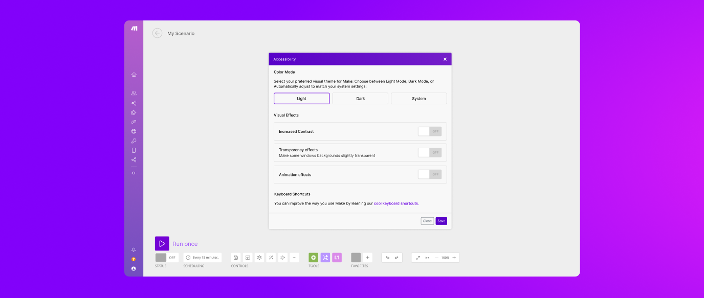
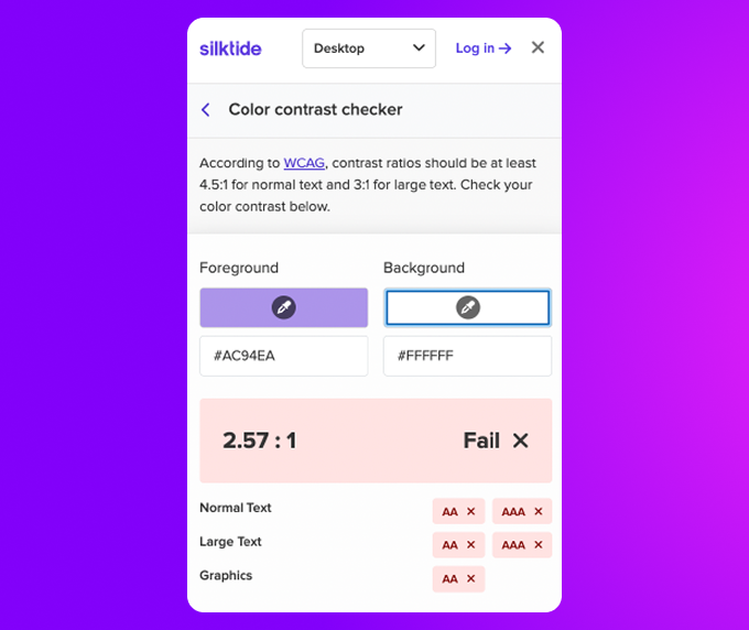
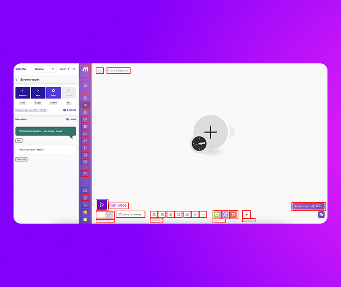
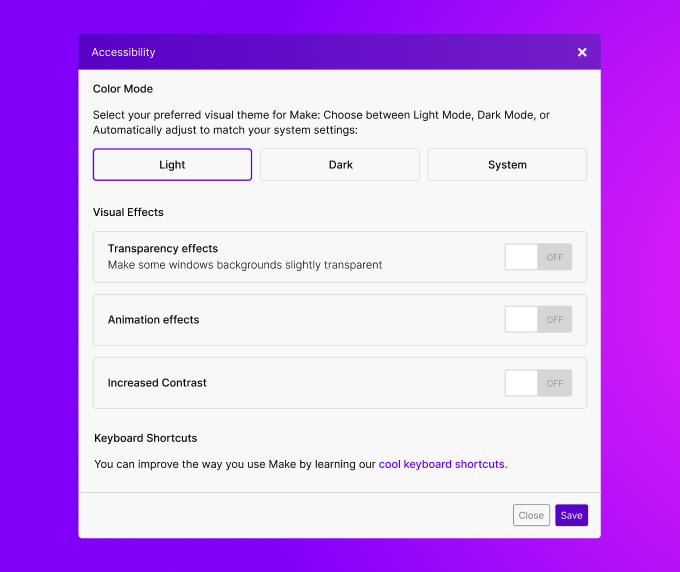
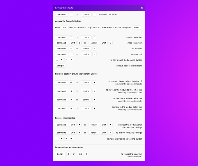
Make's Scenario Builder was completely inaccessible via keyboard, creating significant usability barriers. During my bachelor thesis work I conducted an accessibility audit and designed new features including keyboard navigation, customizable settings, and an accessibility menu to enhance usability.

Team

Solo Project

My Role

UX/UI Design, Accessibility Research, Prototyping

Goals

Conduct an accessibility audit and design accessibility features in Make's Scenario Builder interface

Timeline

3 months (Research, Design, Prototyping, Testing)

case-study-header

Project Overview

The Scenario Builder, a core feature of Make is lacking basic keyboard accessibility, making it unusable for many users. To address this, I've conducted an accessibility analysis, benchmarked best practices, and designed key enhancements to improve usability and compliance with WCAG guidelines.

Accessibility Audit & Findings

I've used the Silktide Chrome extension to evaluate Make's compliance with accessibility standards. The audit identified:

Modified Flow Diagram

Designing Accessibility Solutions

After the research, I designed two screens that could be added to Make's interface.

Customizable Settings Window

  • Added options for color themes (light/dark/system mode).

  • Included toggles for animations, transparency, and contrast adjustments.

  • Moved settings access to the Profile section based on user feedback for a more streamlined interface.

Customizable Settings Window

Keyboard Shortcuts Menu

  • Provided an in-app reference panel for all available shortcuts.

  • Organized key combinations for quick access to essential functions.

  • Updated presentation to separate Mac and Windows shortcuts, improving clarity.

Keyboard Shortcuts Menu

User Research, Testing, Results

To validate the accessibility enhancements, I've conducted usability testing with five participants—three of whom had never used Make before. This allowed me to assess the intuitiveness of the new features while also measuring improvements for existing users.

Key Findings

  • The customization options reduced eye strain and enhanced readability.

  • The shortcuts menu increased discoverability of keyboard interactions.

  • Users found that some features overlapped with existing functions like Fit-to-Screen.

  • Zoom controls were relocated to declutter the UI, improving accessibility.

  • Dark mode was universally praised for enhancing usability.

Notes

This case study was conducted independently of the casual Make business function and could serve as a source of inspiration for the product team.

Get in touch